Visual Storytelling in Branding: How Intentional Imagery Builds Trust and Momentum
“You don't take a photograph, you make it” -Ansel Adams
-
Before someone reads your mission statement, they interpret your image.
Visual storytelling in branding isn’t about aesthetics alone. It’s about perception. The imagery you use influences how people understand your brand, how they feel about it, and whether they trust it. Images don’t just represent who we are. They teach people how to interpret us.
In a crowded market, trust is currency. And intentional brand imagery is one of the fastest ways to build it.
At Fako Media, we approach visual brand strategy as a tool for clarity and momentum. Whether working with nonprofits, founders, or growing companies, the goal is the same: translate vision into clear, human-centered visuals that communicate with precision.
Here are the five strategic considerations we take to create effective visual storytelling in branding.
Lighting
Lighting shapes emotion before words ever do.
In brand photography strategy, lighting decisions influence how your audience reads your image. Where the light falls, how soft it is, and its temperature all communicate intention.
Soft lighting can feel intimate and human. High-contrast lighting can feel bold and editorial. Cool tones can create calm and distance. Warm tones can evoke connection and approachability.
The first photo was created for a wellness brand positioning itself around calm, restoration, and trust. The second was created for an eCommerce company built on boldness and exclusivity.
Using the wrong visual language would’ve undermined the brand positioning before a single word was read.
When lighting aligns with your brand values, your visuals feel cohesive rather than accidental.
Composition
Composition directs attraction.
Strong composition in visual storytelling means deciding what matters in the frame. Through subject placement, layering, and leading lines, you guide the viewer’s eye toward what is most important.
Clear visual hierarchy builds credibility. When brand visuals feel chaotic, the message feels chaotic. When they feel intentional, your audience assumes your business is intentional too.
The first image was created for a music festival focused on generating buzz and ticket sales. Backstage, there were press teams, stage managers, VIPs, and thousands in the crowd. But none of that was the product. The artist was.
So we eliminated the noise and framed the performer as the focal point. Clear subject. Clear energy. Clear reason to buy a ticket.
The second image was created for an app designed to give women more time in their day.
In this case, context was the product. The value wasn’t the app interface alone. It was what the app made possible. So we layered family and home into the foreground and background to visually communicate regained time, presence, and priority.
Strategic composition strengthens brand perception.
Color
Color influences mood, identity, and memory.
In intentional branding, color is not decorative. It reinforces positioning and emotion.
Bold, expressive palettes can energize a campaign. Muted tones can signal refinement. Monochrome imagery can highlight texture and emotion.
The first image was created for a Medspa positioning itself as medically backed rather than luxury-forward.
We removed color to eliminate distraction and introduce clinical seriousness. Black and white shifts the focus to structure, texture, and expertise. It communicates authority before a single credential is read.
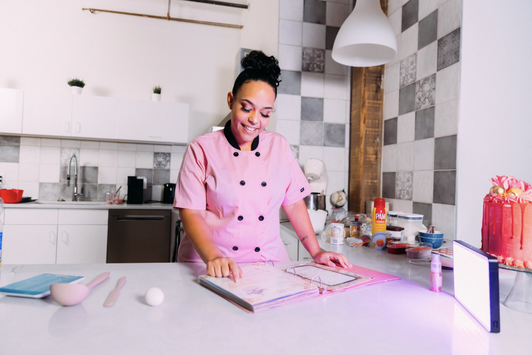
The second image was created for a small business owner who sells cupcakes and leans confidently into her femininity. We amplified color with a pink gel to heighten warmth, personality, and delight. The saturation reinforces brand identity instead of competing with it.
Consistent color usage across your brand imagery builds recognition. Recognition builds familiarity. Familiarity builds trust.
Color is one of the most powerful tools in visual brand strategy.
Tone
I always joke that I hate telling a businessperson about the importance of “the vibe.” But what we casually call vibe is actually perception architecture. And perception influences trust long before pricing or features do.
Through styling, color, composition, and context, visual storytelling creates a consistent feeling that matches the story you are telling.
Your tone might be playful, refined, energetic, grounded, or calm. What matters is consistency. When tone shifts without intention, it creates confusion. When tone is aligned, it strengthens brand equity.
The first shot was for placement in Meijer’s retail catalog. In that environment, clarity is the priority. Clean framing, minimal distraction, and direct product visibility ensure the item can be scanned quickly and understood instantly. Lifestyle elements would have competed with function and reduced retail effectiveness.
The second image was created to drive engagement at a festival brand activation.
Here, the goal wasn’t product isolation. It was momentum. We leaned into the environment and personality to communicate energy, social proof, and experience. This image was built for social media, where context and vibe drive interaction.
Consistency in brand visuals signals professionalism and clarity.
Presence
Presence is the energy people, places, and objects bring into the frame.
Great brand imagery captures more than surface-level appearance. It reflects personality, confidence, and story.
About 85% of our work involves live subjects. And every person brings their own history, comfort level, and self-perception into the frame. Our job isn’t just to capture them. It’s to create the conditions where they feel secure enough to show up honestly.
When people feel safe, their posture changes. Their expressions soften. Their confidence becomes natural rather than performed.
That’s when the story becomes real.
Creating presence requires direction, engagement, and space for authenticity. When subjects show up fully, audiences connect more deeply.
That connection is what transforms brand photography into brand storytelling.